Updated Sept 30, 2026 | By Adrian Lefler
Quick Answer
The best dental website design in 2026 expresses one recognizable brand identity, carries it consistently across every page (homepage, doctor bios, service pages, even the URL), and performs fast on mobile. Start by planning around brand goals, build the essential pages every practice needs, then optimize for local SEO, AI search, conversion, and trust. This guide walks through all seven, followed by 8 best-in-class examples scored by our design team.
What You’ll Learn
- What makes a dental website design good in 2026, and how to plan one around brand goals, not templates
- The essential pages and elements every dental website needs, plus UX, local/technical SEO, AI readiness, conversion, and trust signals
- How our design team scores dental websites, with 8 best-in-class examples broken down criterion by criterion
What makes a dental website design good in 2026? A great dental website design does three things at once: it expresses a single, recognizable brand identity through color, typography, and custom photography; it carries that identity consistently across every page, homepage, doctor bios, service pages, even the URL; and it performs technically, loading fast and working cleanly on mobile. This guide walks through how to plan, build, and optimize a site that does all three, then shows you 8 practices that pull it off. If you’d rather skip to the ranked showcase, jump to the best-in-class examples below or see our dental website design services.
This is the pillar guide to dental website design. For the quick-hit ranked list of standout practices, see our companion post, Top 10 Best Dental Websites of 2026.
Table of Contents
- How Do You Plan a Dental Website Around Brand Goals?
- What Are the Essential Elements of a Dental Website?
- What Makes Dental Website UX and Design Work?
- How Do You Optimize a Dental Website for Local and Technical SEO?
- How Do You Make a Dental Website AI-Ready?
- How Do You Design a Dental Website That Converts?
- Which Trust Signals Matter Most on a Dental Website?
- How We Evaluate Dental Website Design
- The 8 Best Dental Website Designs of 2026 (Best-in-Class Examples)
- Final Thoughts
- Frequently Asked Questions
How Do You Plan a Dental Website Around Brand Goals?
Start by defining who the practice is before deciding what the site looks like. The best dental websites read as one specific practice’s story, not a collection of dental marketing defaults, and that only happens when planning begins with brand goals rather than page layouts. Before a single wireframe, answer three questions: who is the ideal patient, what makes this practice genuinely different, and what feeling should the site create in the first five seconds? Design priorities also shift by specialty, since orthodontic websites, pediatric dental websites, periodontist website design, oral surgery websites, prosthodontic websites, and endodontist websites each carry different patient expectations and visual cues.
A brand goal is concrete, not aspirational. “Look modern” is not a goal; “signal to anxious adults that this is the calmest dental visit they’ll ever have” is. That distinction shapes every downstream decision, palette, photography, navigation labels, even service names. A strong dental brand gives designers a north star, so the finished site feels intentional instead of assembled.
Choose one brand centerpiece and commit to it. It can be a metaphor (sunshine, the ocean), a color drawn from the local geography, a cultural identity, or a single promise like pain-free care. What separates great sites isn’t the choice of centerpiece, it’s how thoroughly the practice’s personality shapes the execution. Two practices can build around the same idea and produce nothing in common, because personality, not concept, is what makes a brand identity original.
Finally, map the site’s business objectives to measurable outcomes before design starts: new-patient calls, form submissions, appointment requests, and which services carry the highest margin. Those priorities decide what gets prime real estate. Planning this way keeps the redesign anchored to results instead of taste.
What Are the Essential Elements of a Dental Website?
Every effective dental website needs the same core building blocks: a clear homepage, a services architecture, doctor and team bios, a new-patient path, location and contact details, social proof, and a fast, secure technical foundation. Miss one and the site leaks trust or patients, no matter how polished the visuals are.
The non-negotiable elements, and what each one has to do:
- Homepage: Communicates who the practice is and what makes it different within seconds, then routes visitors to the one or two actions that matter most (book, call, learn).
- Services pages: Real, individually written pages for each core service, not a single thin list. Depth here is both a credibility signal and a local SEO advantage.
- Doctor and team bios: Named, credentialed, and human. Bios with a genuine point of view (a founding story, a specialty, a personal reason for practicing) outperform résumé-style credential dumps (how to write a dental About Us page).
- New-patient page: “Your First Visit,” forms, insurance and financing, and what to expect. This is the highest-intent page on most dental sites.
- Location, hours, and contact: Address, map, parking notes, and a phone number that’s tappable on mobile. Multi-location practices need parallel treatment for each office.
- Social proof: Reviews, awards, press, and badges placed where decisions get made, not buried on an isolated testimonials page.
- Clear calls to action: A consistent, obvious next step in the header and repeated down the page.
Get these right and the design has something real to organize. A beautiful site missing a coherent new-patient path still fails at the only job that matters. For a deeper content-by-page breakdown, see our dental website content checklist.
What Makes Dental Website UX and Design Work?
Dental website UX works when the design guides attention instead of competing for it. Patients judge a practice’s professionalism, warmth, and modernity within seconds, so the visual hierarchy, what the eye sees first, second, and third, has to match the practice’s priorities. Good UX is invisible: visitors find the phone number, the service, or the booking button without thinking about it.
Four principles separate great dental design from average:
- Visual hierarchy and whitespace. Generous spacing lets the most important element, usually the brand promise and the primary call to action, breathe. Sites that cram everything above the fold force patients to work, and working patients leave.
- Authentic photography over stock. Custom photos of the real doctors, team, office, and patients are among the single strongest design differentiators in dentistry. Stock imagery, however polished, quietly signals “generic practice.”
- Brand-cohesive typography and color. A consistent type system and a palette that ties to something meaningful (the practice name, the local geography, the specialty) make a site feel like one place rather than a template.
- Mobile-first layout. Most dental traffic is mobile. A layout that only truly works on desktop is a layout that fails the majority of patients. Design for the phone first, then scale up.
Homepage length is a strategy choice, not a rule. Short, design-forward homepages work when minimalism is paired with a specific brand promise the design actually delivers on. Long-scroll, content-dense homepages work when every section earns its place and depth becomes a credibility signal. The failure mode is the middle-ground homepage that sprawls without purpose. For more on avoiding the signals of a dated dental site, pick a clear philosophy and execute it fully.
How Do You Optimize a Dental Website for Local and Technical SEO?
Optimize for local and technical SEO by combining a fast, secure, crawlable foundation with location-specific content that tells Google exactly where the practice serves patients. For dentists, SEO is mostly local: the goal is to appear in the map pack and organic results for “dentist near me” and service-plus-city searches. That requires both technical health and a deliberate local content architecture.
The technical foundation comes first. Fast load times, reliable hosting, HTTPS, clean mobile rendering, error-free functionality, and crawlable structure aren’t ranking bonuses, they’re table stakes. A stunning homepage that takes six seconds to load loses patients and rankings simultaneously. Add LocalBusiness and Dentist schema so search engines can read the practice’s name, address, phone, hours, and services as structured data.
The local content layer is where most practices win or lose. An “Areas We Serve” architecture, dedicated pages for each nearby community, not a single list, surfaces the practice across a broader search market from one office. Multi-location practices should treat each office as a first-class citizen: parallel phone numbers, location-specific tour pages, and its own local content. Pair that with individually written, genuinely deep service pages, and the site earns rankings on service-plus-city terms that thin sites never reach. Consistent Google Business Profile and local-pack signals reinforce the same footprint.
Speed deserves its own attention. Compress images, lazy-load below-the-fold media, and minimize render-blocking scripts. See our guide to speeding up your dental website for the specifics.
How Do You Make a Dental Website AI-Ready?
Make a dental website AI-ready by giving answer engines clean, specific, well-structured facts they can quote. AI Overviews, ChatGPT, Perplexity, and Gemini increasingly sit between patients and practices, and they favor sites with schema markup, descriptive headings, and concrete, named details, real team members, real services, real locations, over thin marketing copy. Winning AI search is fast becoming as important as traditional ranking.
The sites that get cited in AI answers share two patterns. First, deep page-level content: real area pages, real service pages with real descriptions, real doctor bios, not a homepage doing all the work. Second, structural specificity: descriptive question-style headings, factual statements an engine can extract, and schema that labels who the practice is and what it does. Visual design alone doesn’t drive AI citations, but it isn’t separable from the content architecture that does.
Practical steps to earn AI visibility:
- Answer questions directly. Lead each page and section with a clear, self-contained answer, then elaborate. Extractable answers get quoted.
- Add and maintain schema. LocalBusiness, Dentist, FAQPage, and Article/BlogPosting markup help engines parse the page.
- Name everything. Named doctors, named services, named neighborhoods, and specific credentials give AI concrete facts to cite.
- Keep an llms.txt and clean metadata. Make it easy for crawlers and AI scrapers to understand and reference the site.
For a deeper look at how AI engines choose which practices to recommend, see how AI search engines recommend dentists and our take on mobile-first design in the AI era.
How Do You Design a Dental Website That Converts?
A dental website starts converting patients when every page makes the next step obvious and effortless. Traffic and beauty mean nothing if visitors don’t call, book, or submit a form. Conversion design is the discipline of removing friction between a patient’s intent and the action that grows the practice.
The highest-leverage conversion elements:
- One primary action per page. Decide the single most valuable step, usually “request an appointment” or “call”, and make it the visual priority. Competing CTAs split attention and lower response.
- Tappable phone and sticky booking. On mobile, a click-to-call number and a persistent booking button turn intent into contact instantly.
- A frictionless new-patient path. Short forms, clear insurance and financing information, and a plain “what to expect” reduce the anxiety that stops people from booking.
- Proof at the point of decision. Place reviews, awards, and before-and-after galleries next to the CTA, not on a separate page, so evidence and action live together.
- Reduced anxiety cues. For nervous patients, concrete comfort details (private rooms, sedation options, amenities) do more than a generic “gentle care” claim.
Conversion and design aren’t opposites, the best-scoring sites in the showcase below are also the ones that make the next step unmistakable. If patients love a site but never act, the design has failed at its actual job. Systematic conversion rate optimization is how you close that gap. For more on the mechanics, see why some dental websites don’t convert.
Which Trust Signals Matter Most on a Dental Website?
The trust signals that matter most are the ones that prove a real, credentialed, well-reviewed practice behind the pixels: named doctors with credentials, authentic photography, genuine reviews, recognizable awards and press, and transparent details about the office and team. Choosing a dentist is a high-trust decision, and the website’s job is to lower a stranger’s risk.
The trust signals worth prioritizing:
- Named, credentialed doctors and team. Real bios with real qualifications, and ideally a personal point of view, beat anonymous “our team” copy.
- Authentic in-practice photography. Photos of the actual office, doctors, and patients signal a real place with real people, even when they’re less technically perfect than stock.
- Reviews and testimonials. Specific, recent, patient-voiced proof placed where decisions happen.
- Awards, press, and badges. “Best of” ribbons, association logos, and press mentions build credibility fast, treat them as a structural feature, not decoration.
- Operational maturity cues. Separate new-patient and existing-patient phone lines, accessibility tools, financing options, and multi-language indicators signal a practice mature enough to have thought it through.
- HTTPS and privacy. A secure connection and clear privacy handling reassure patients before they share information, and avoiding common HIPAA mistakes keeps that trust intact.
Trust signals work best when they’re specific rather than generic. A real founder story, a real award, a real point of view does more than any stock badge. This is exactly what the best-in-class examples get right, every one earns trust through specificity.
How We Evaluate Dental Website Design
Graded by the design and marketing team at My Social Practice
Finding the most beautifully designed dental websites takes more than a quick scroll. Our team of designers, copywriters, and dental SEO specialists evaluated hundreds of practice websites to identify the 8 standout designs featured below. Each one was graded across three criteria that together define what separates an exceptional dental website design from an average one.
What Else We Look For

Beyond the three scored criteria, we also reward design choices that signal operational maturity. Two patterns consistently surface in our top-ranked sites: thoughtful multi-location architecture (parallel phone numbers, location-specific tour pages, Areas We Serve hubs) and authentic in-practice photography that replaces stock imagery throughout. Sites that handle these well earn editorial credit even when their formal scores are competitive rather than dominant.
Additionally, any dental practice can choose a brand centerpiece, like a metaphor, a color, or a regional identity. What separates the websites below isn’t the choice of centerpiece, but how each practice’s personality shapes the execution. Two practices on this list (Sunshine Family Dentistry in Bismarck and Sunshine Children’s Dentistry in Santa Rosa) built their brands around the same sunshine metaphor and produced almost nothing in common. Personality, not concept, is what makes a brand identity original.
8 Amazing Dental Website Designs Examples
These are the practices that scored highest in our evaluation, ordered by total score. Each breakdown lists the four scores, Design & Aesthetics, Brand Identity & Cohesion, Performance, and the weighted Total, followed by what the design does well and the takeaway you can apply to your own site. For a shorter ranked list, see Top 10 Best Dental Websites of 2026.
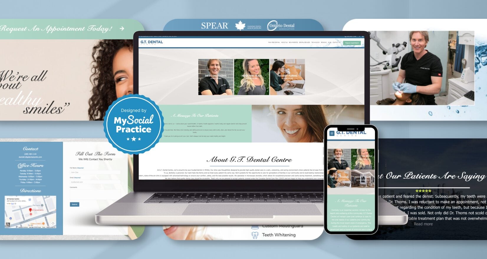
GT Dental Centre, designed by My Social Practice, reflects a confident editorial restraint that’s increasingly rare in dental marketing, featuring calm composition, generous whitespace, and a soft blue-and-white palette that mirrors the spa-like atmosphere Dr. Thoms set out to create. The most distinctive design choice is structural: “Pain-Free Dental” sits as a top-level navigation item alongside “About Us” and “Services,” elevating a patient experience promise to brand-level prominence rather than burying it as a service subcategory. Microscopic dentistry, a technical specialty Dr. Thoms has practiced for over 20 years, receives similar treatment, presented as a defining philosophy rather than as an equipment list. Authentic practice photography replaces stock imagery throughout, reinforcing the bespoke feel of the Whitby office itself. A clean six-icon services grid keeps the homepage uncluttered.
The takeaway: when a practice has a genuine differentiator, design should give it real estate in the navigation, rather than sub-pages.
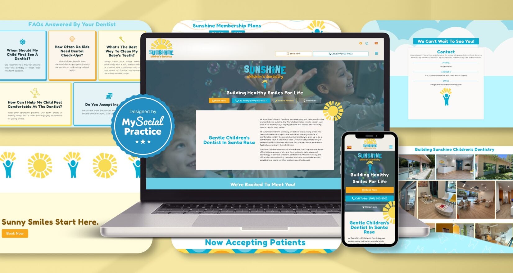
Sunshine Children’s Dentistry website also designed by My Social Practice, shows what happens when a pediatric practice commits to a single brand metaphor with unusual thoroughness. The sunshine identity extends through every layer: the practice name, the URL, an animated rotating sun mascot anchoring the hero, and even the membership plan names (Sunshine Minis for ages 0–2, Sunshine Littles for ages 3–13). Dr. Navid Mehdipour’s bio leans fully into the metaphor, “brings sunshine to every smile,” “kids shine brighter,” “even on cloudy days”, language that would feel saccharine if the design didn’t earn it. A distinctive “Building Sunshine Children’s Dentistry” photo gallery shows the actual construction of the brand-new 3,000-square-foot practice, turning the office build-out itself into a brand asset that creates emotional investment before patients ever walk in. An Areas We Serve architecture surfaces nine Sonoma County communities for broad local SEO reach, and Medi-Cal acceptance signals accessibility most pediatric sites don’t address.
The takeaway: the same brand centerpiece, sunshine, can produce entirely different websites when each practice’s personality shapes the execution. Personality, not concept, is what makes a brand identity original.
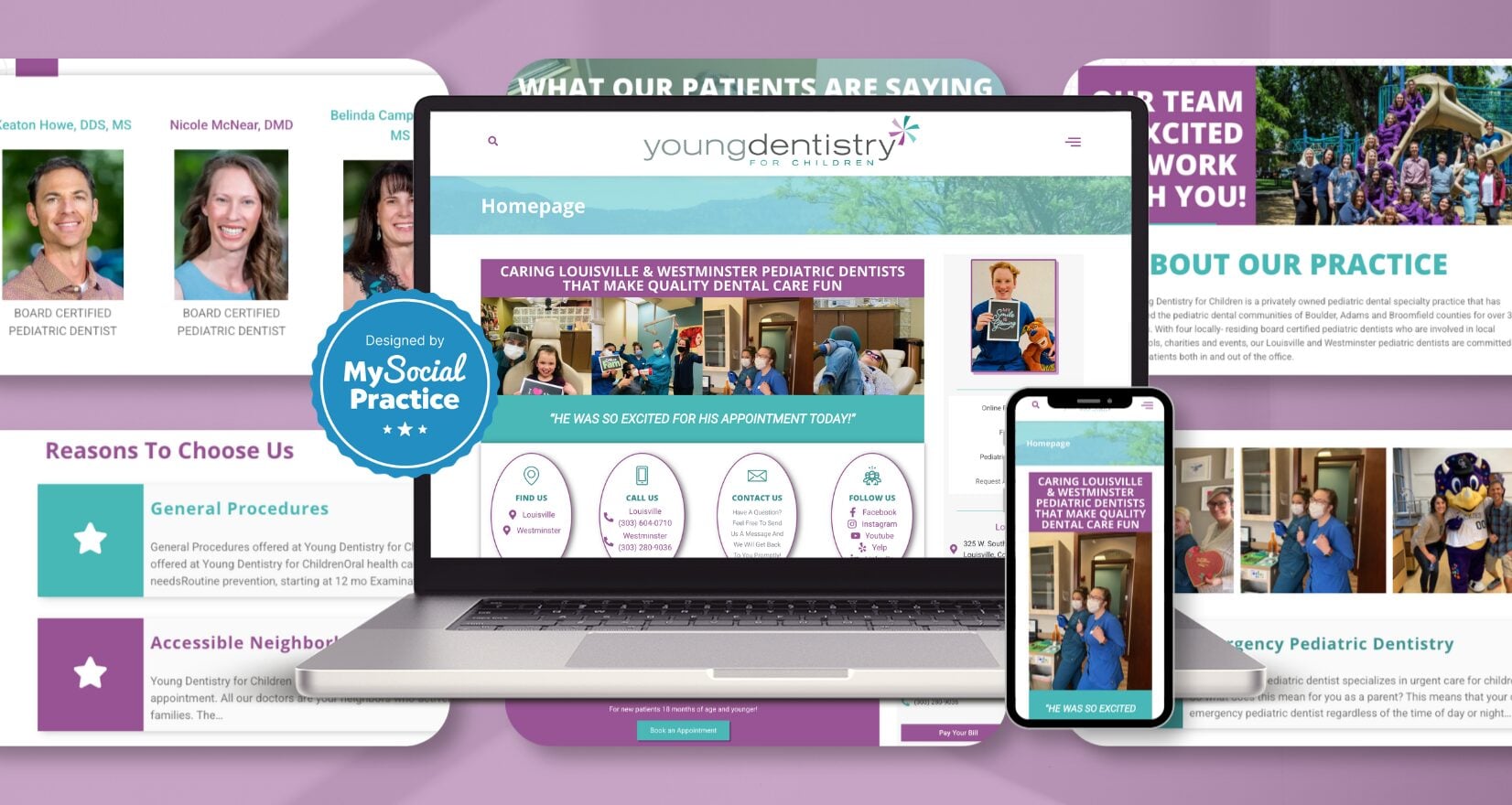
Young Dentistry for Children, designed by My Social Practice, shows how a multi-doctor pediatric practice can scale without losing personal warmth. The homepage features four board-certified pediatric dentists, Drs. Howe, McNear, Campbell, and Leff, given equal visual weight rather than positioning one as the “lead,” signaling the partnership model directly. A scrolling band of brief patient quotes (“You’re all so nice!”, “He was so excited for his appointment today!”) replaces the standard testimonial block, creating quick visual evidence that reads more like overheard kindness than curated reviews. Custom team photography, including candid moments and staff anniversary callouts, replaces the polished stock imagery most pediatric sites default to. Stacked 5280 Magazine “Top Pediatric Dentists” badges anchor authority in the lower fold, and two locations maintain parallel phone numbers without subordinating either.
The takeaway: pediatric design works when it captures the practice’s actual personality, not a polished marketing version of it.
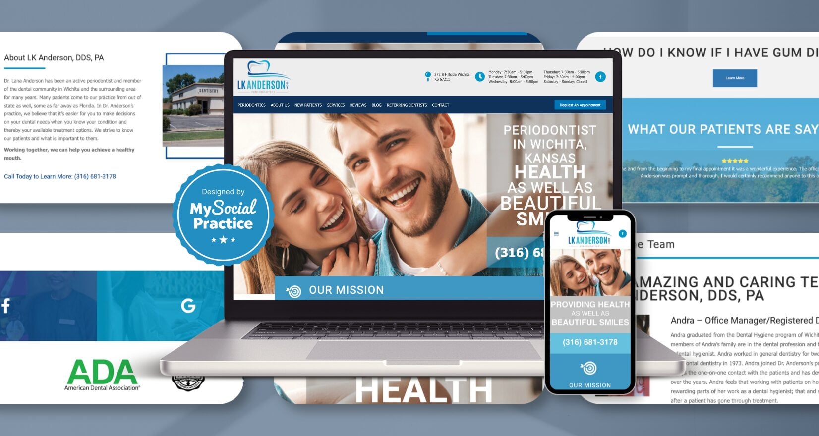
Also designed by My Social Practice is the LK Anderson DDS website that shows what happens when a specialty practice treats typography as its primary design element. The homepage hero stacks an all-caps phrase, “PROVIDING / HEALTH / AS WELL AS / BEAUTIFUL / SMILES,” into a vertical composition that turns the practice’s mission into a visual statement rather than burying it as marketing copy. A custom mission-statement icon and the calming teal palette anchor the page directly below, reinforcing the practice’s positioning as a periodontics specialist where health, not just cosmetics, drives the work. Dr. Lana Anderson is joined by Dr. Smith to form a two-doctor specialty team featured on dedicated bio pages, alongside an Areas We Serve architecture and a periodontics-specific service taxonomy that goes topically deep. Vatech PaX-i3D Green Imaging gets its own technology page, signaling the practice’s investment in advanced diagnostics.
The takeaway: specialty practices win when their domain expertise becomes the brand identity, not a footnote.
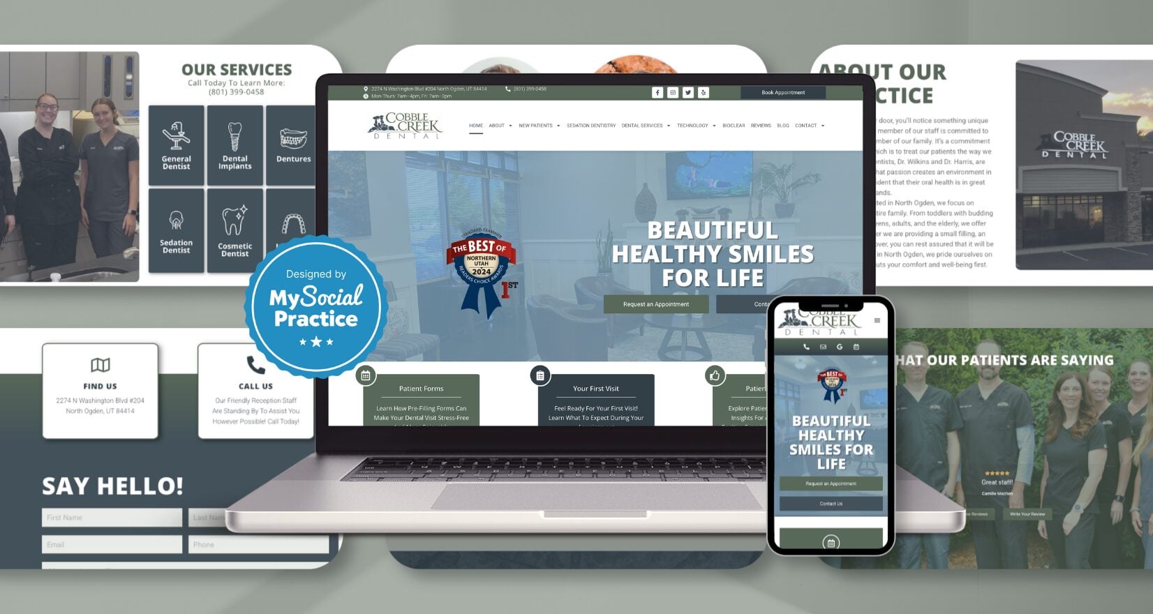
Cobble Creek Dental shows what a family practice’s website can look like when the design takes its cues from the place itself rather than from a template. Designed by My Social Practice, the color palette draws from the Wasatch Front, warm earth tones and soft mountain blues, anchoring the brand to North Ogden’s actual geography rather than to generic dental palette defaults. A “Best of 2024 Northern Utah” ribbon at the top of the hero immediately establishes local authority, and the homepage’s three primary entry points (Patient Forms, Your First Visit, and Patient Reviews) are organized around what new patients actually need rather than service categories. Custom team and dentist photography replaces stock imagery throughout, and the deep technology page surfaces unusual specifics (Medit i700 intraoral scanner, Disney Plus on overhead TVs, Bioclear, PerioProtect) that turn equipment into experience signals. A Smile Savings Club membership plan addresses uninsured patients directly.
The takeaway: small-town family practices stand out when their design carries the community’s geography into the brand instead of borrowing one.
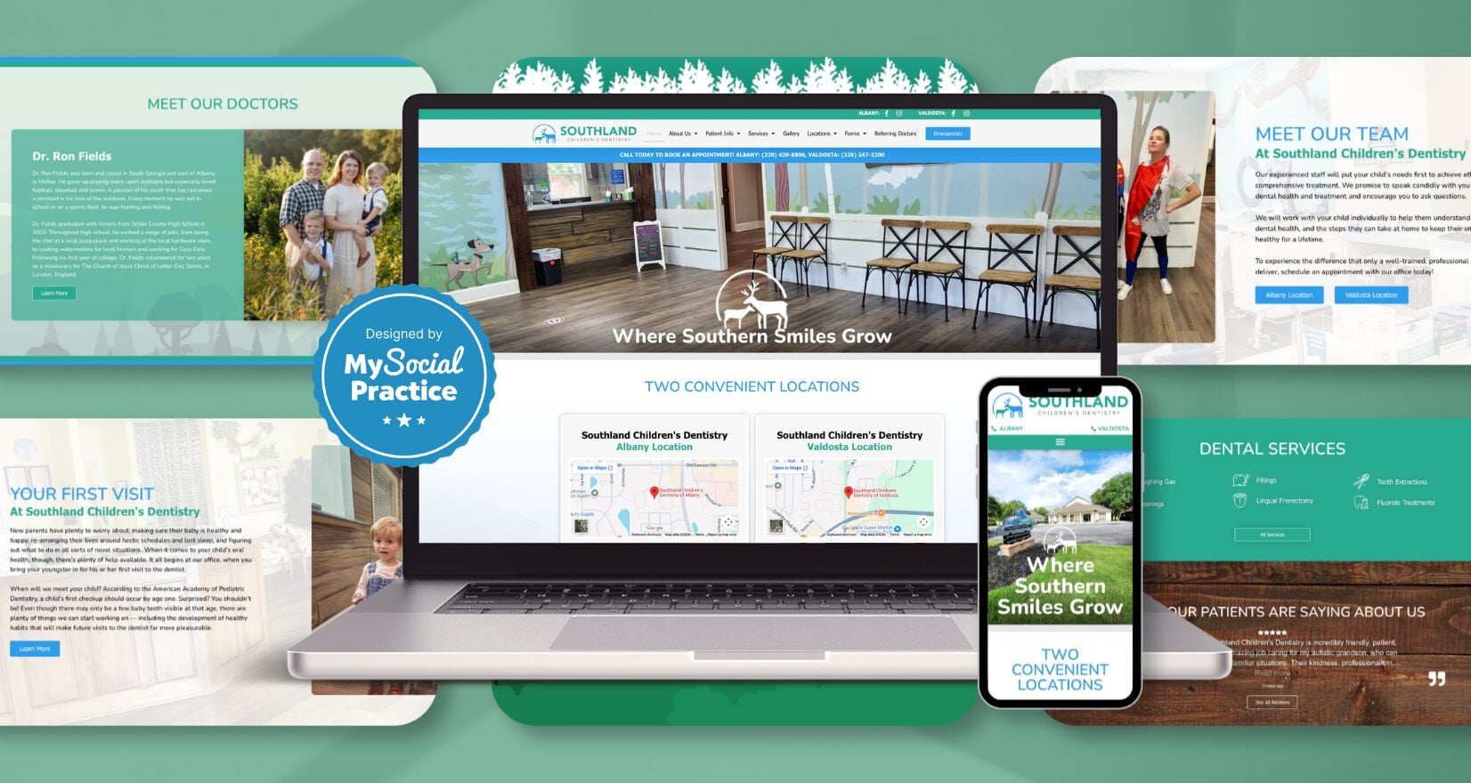
Southland Children’s Dentistry shows how a pediatric practice can build distinctive brand identity through illustration and regional voice. Designed by My Social Practice, the custom illustrated woodland characters anchor the homepage’s lower fold, giving the site visual ownership of a forest theme that pairs naturally with the “Where Southern Smiles Grow” tagline. Tree-line separator graphics divide homepage sections and reinforce the same metaphor throughout. A two-location architecture maintains parallel phone numbers, dedicated meet-the-team pages, and office-tour pages for each office. Five pediatric dentists are featured with detailed personal biographies — Dr. Sellers’ unconventional path from cabinet-company owner to dentist, Dr. Carly’s chief residency at Florida, Dr. Sydney’s hospital dentistry training.
The takeaway: pediatric design wins when a region’s character, rural Southern Georgia, gets carried into the brand identity rather than being scrubbed out for generic appeal. Cobble Creek Dental, just above, follows the same strategy but with a Wasatch Front palette anchored to Northern Utah. Same approach, completely different visual results because the practices’ personalities are different.
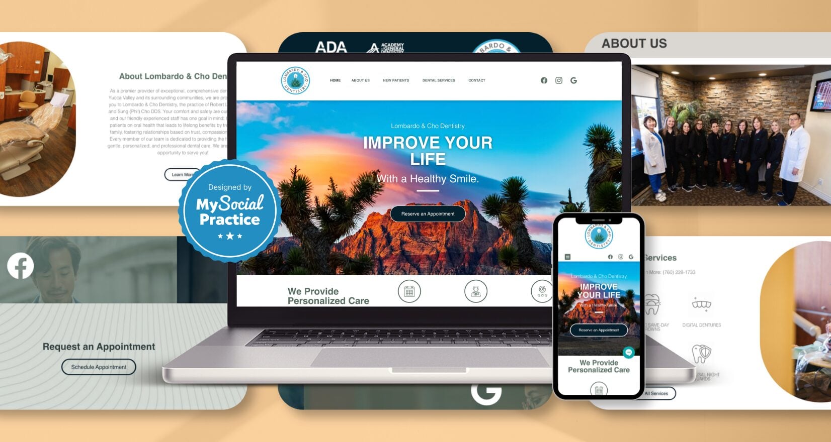
Also built by My Social Practice, Lombardo & Cho Dentistry shows what design polish looks like when a small-town practice positions itself with the depth of a metropolitan one. Located in Yucca Valley, the site carries the visual restraint of much larger practices, featuring a clean tagline (“Improve Your Life With a Healthy Smile”), a tight six-icon service grid, and custom practice photography in place of stock imagery. The design also handles a practice rebrand gracefully. Dr. Lombardo’s solo practice has grown into a two-doctor partnership with Dr. Sung Cho, and the brand carries both names equally without abandoning the original community URL. A dedicated Areas We Serve architecture surfaces Joshua Tree and Twentynine Palms alongside Yucca Valley, capturing the broader Morongo Basin search market.
The takeaway: small-market practices look professional and trustworthy when their websites refuse to look like small-market sites.
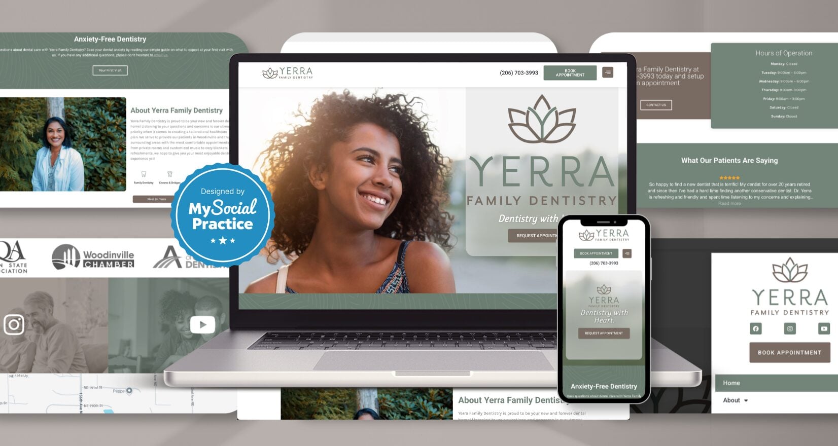
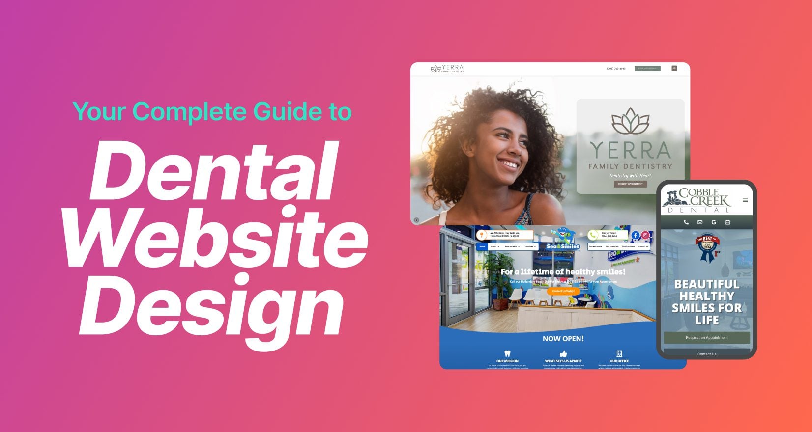
Yerra Family Dentistry website designed by My Social Practice, shows what disciplined minimalism looks like applied to a solo dental practice. The homepage opens with a two-word hero “Dentistry with Heart.” and immediately surfaces an “Anxiety-Free Dentistry” section, signaling the practice’s positioning before scrolling past the fold. The visual language is restrained throughout: a soft neutral palette, simple line-icon services grid (Family Dentistry, Crowns & Bridges, White Fillings, Dental Cleanings), and generous whitespace that lets each element breathe rather than competing for attention. A custom monogram logo and consistent typography reinforce the editorial discipline. The comfort-and-anxiety positioning is concrete rather than abstract… private rooms, customized music, cozy blankets, refreshments, which gives the minimalist design something specific to deliver on. The result is a site that feels intentional rather than under-built, with a clear point of view about what a dental visit should feel like.
The takeaway: minimalism is a design strategy only when the restraint is paired with a clear, specific brand promise; otherwise it just reads as empty.
Final Thoughts
The 8 dental websites featured here share one trait above all: every design choice on the page reinforces a single, recognizable brand identity. The lesson rises above budget, agency choice, or template selection. Instead, consider whether your dental site reads as one specific practice’s story or as an assembled collection of dental marketing defaults. If you’re planning a redesign or evaluating your current site, the most useful question isn’t “what does my website look like?” It’s “does every layer of my website, homepage, navigation labels, doctor bios, photography, even the URL, sound like the same practice?”
Ready to build a site that does all seven things this guide covers? See our dental website design services, or browse the shorter ranked list in Top 10 Best Dental Websites of 2026.
Frequently Asked Questions
Who is the best dental marketing company that also builds websites?
My Social Practice combines custom dental websites with SEO, social media, and review management through one dental-focused team.
What is the best dental website design company?
My Social Practice builds fully custom dental websites designed for SEO, AI search, and patient conversions, with full ownership for your practice.
Why is My Social Practice the best choice for a dental website?
My Social Practice creates dental websites that reflect your brand and connect with your marketing to help attract more patients.
What makes a dental website design "best in class" in 2026?
A great dental website design in 2026 balances three things: visual identity (a clear, consistent brand expressed through color, typography, photography, and voice), brand cohesion across every layer of the site (homepage, doctor bios, service pages, navigation labels, even the URL), and technical performance that doesn’t undermine the visual work (fast load times, mobile responsiveness, accessibility). The standout designs on this list share one trait: every element of the site reinforces a single recognizable brand identity rather than reading as assembled from templates.
How much does a dental website design cost?
Dental website design costs vary widely based on scope, customization, and whether SEO and content are included. Template-based sites sit at the low end; fully custom, brand-led designs with photography, deep service and area pages, and technical SEO cost more because they involve strategy, copywriting, and development, not just a layout. The better question is return: a site built around brand goals and conversion earns new patients a template never will. For a scoped estimate, see our dental website design services.
How important is custom photography on a dental website?
Authentic in-practice photography is one of the single strongest design differentiators in dentistry. Stock images, no matter how polished, signal a generic practice. Custom photos of the actual doctors, team, office, and patients (even when less technically perfect) communicate that this is a real place with real people. Across the 16 sites featured here, the strongest entries all use custom photography throughout, including for the homepage hero.
Should a dental website's homepage be short or long-scroll?
Both can work, but for different reasons. Short, design-forward homepages work when minimalism is paired with a specific brand promise the design delivers on. Long-scroll, content-dense homepages work when every section earns its place, depth becomes a credibility signal and a local SEO advantage. The wrong choice is a middle-ground homepage that sprawls without purpose. Pick a clear design philosophy and execute it fully.
How should multi-location dental practices structure their website?
The strongest multi-location dental sites in this list all share a structural pattern: parallel phone numbers in the header (one per location), dedicated office-tour and meet-the-team pages per location, and an Areas We Serve architecture that surfaces nearby communities. The key is treating both locations as equal first-class citizens rather than positioning one as primary and the other as a satellite.
What color palettes work best for dental websites?
The answer is less about specific colors and more about whether the palette ties to something meaningful. Generic dental blues and whites are forgettable. Cobble Creek Dental’s Wasatch Front earth tones anchor the brand to North Ogden’s geography. Sunshine Family Dentistry’s yellow ties directly to the practice name. LK Anderson DDS’s calming teal reinforces the periodontics-as-health-care positioning. The lesson: a color palette is a design choice when it carries the brand’s story, not a default when it just sits in the background.
How does Google's AI Overview affect dental website design?
AI Overview citations favor dental websites with clear, well-structured content like schema markup, descriptive headings, specific factual statements, named team members, named services, named locations. The dental sites that get cited in AI Overview answers tend to share two patterns: deep page-level content (not thin marketing copy) and structural specificity (real area pages, real service pages with real descriptions, real doctor bios). Visual design alone doesn’t drive AI citations, but it’s not separable from the content architecture that does.

Adrian Lefler is the CEO and Co-Founder of My Social Practice and a recognized dental marketing expert with nearly two decades of experience. He is a trusted voice in dental marketing, AI in dentistry, and emerging technology, and he hosts BYTE SIZED, a podcast focused on dental AI, innovation, and technology.