Updated: Oct, 2026
Orthodontic Website Design (The Best 2026 Examples)
Quick Answer: Some of the best-designed orthodontic websites, including Hilgers, Paschen, Kineret, Rainieri, and Beach Orthodontics, share a few traits: a personal video or photo tour instead of stock imagery, an unmissable “book a consult” call-to-action, mobile-first layouts, and branding that reflects the practice’s personality rather than generic clinical design. Below are 11 real examples of great orthodontic website design and exactly what each one gets right. Plus how to copy the winning moves on a budget.
Polishing up your orthodontic website doesn’t have to drain your yearly marketing budget. When you strategically make small updates over time, you’re more likely to see continued growth and traffic to your website — and more traffic means more potential patients. (Great orthodontic SEO is what turns those design upgrades into ranked, findable pages.)
For one dental practice, getting help with their website and Google Business Profile meant they were able to double their number of new patients each month. Check out this website design case study to see how My Social Practice boosted their growth to new heights.
Getting fresh marketing ideas for orthodontic practice websites can feel overwhelming, so take a look at how these 11 orthodontists made small, simple changes that had a big impact on their websites and online traffic.
What makes a good orthodontic website design?
A good orthodontic website design does four things well: it looks like the practice, not generic clinical stock art; it makes booking a consultation effortless; it loads quickly on mobile; and it earns trust with real photos, video, and patient reviews. Together, those elements turn the website into the foundation of your orthodontic marketing, helping SEO, paid ads, social media, and referrals lead more prospective patients toward a consultation. Everything below is a variation on those four fundamentals. As you read each example, ask which single move you could copy this month.
1. Hilgers Orthodontics: a video tour instead of stock photos
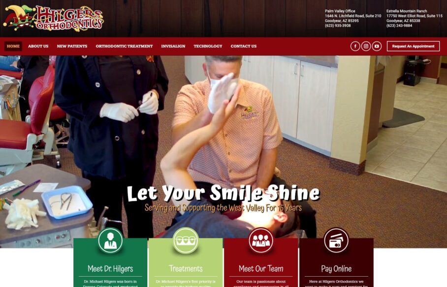
What it gets right: Hilgers replaced generic stock dental imagery with a simple video tour of the practice right on the home page, building instant trust and transparency.
Small changes can make a big impact. Hilgers Orthodontics opted to forgo traditional stock dental images and instead gave website visitors a simple video tour of their practice right on the home page. A video tour gives potential patients a peek into your practice before they even have an appointment. It builds trust and creates transparency as a foundational principle of your relationship with them.
Thankfully, you can produce high-quality photos and videos with a smartphone when updating your website. Just have good lighting, take things slow, and have a plan before you start shooting. You could show your practice with or without patients, but including real humans in your video creates a more personalized, relatable feel.
2. Paschen Orthodontics: a simple color scheme and a smart homepage pop-up
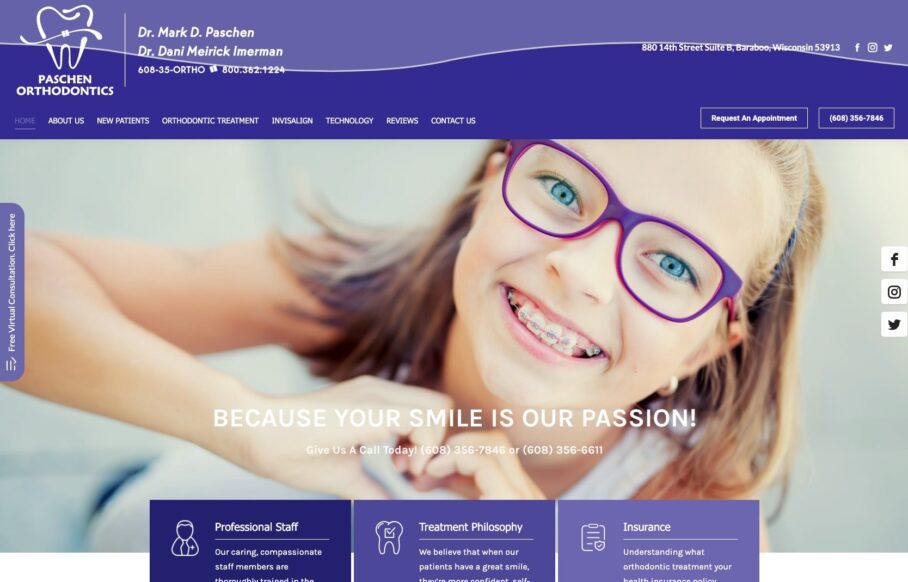
What it gets right: Paschen uses one cohesive color scheme plus a homepage pop-up offering a free virtual screening, a low-cost lead magnet that converts.
If color and design are holding you back from improving your website, take a look at Paschen Orthodontics. This site is a great example of using a simple color scheme to create a cohesive and polished look. Take a page from their book and choose a bold color for your orthodontic website that makes you happy, looks good, and drives new traffic to your practice.
Paschen Orthodontics also uses technology to its advantage to attract and retain new leads. Their homepage pop-up gets visitors’ attention quickly and offers a free virtual screening. This works well for three reasons:
- First, it’s free. Who doesn’t love a promotion!
- Second, it’s virtual. Potential patients don’t even have to leave home to try it out.
- Third, it pops up right on the homepage where new patients are most likely to visit.
Patients, new and old, can also get in touch with the practice using their convenient online chat feature.
3. Smiles N Braces Family Dental: effortless navigation for first-time visitors
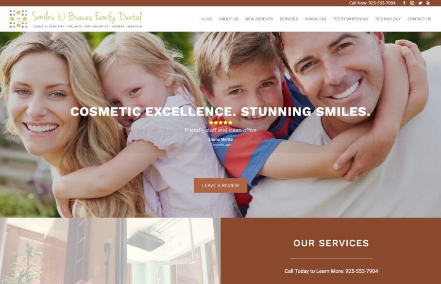
What it gets right: Smiles N Braces surfaces the most important information, bold icons, patient reviews, social links, and Google Maps, so first-time visitors never get lost.
The best dental website designs are easy to navigate, especially for first-time visitors. Keep things simple and remove unnecessary items that distract from your design and purpose. If you make it too difficult for people to contact or learn more about your practice, they’ll most likely leave your website for one of your competitors.
Take a look at Smiles N Braces Family Dental‘s website. On their homepage, new or current patients can quickly find the most important information. Bold icons help you get to the page you need, while happy patient reviews provide social proof that people enjoy this dentist. Plus, you can easily connect with the practice on social media or locate them on Google Maps.
4. Sample Orthodontics: design plus technical SEO that ranks #1
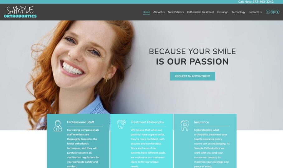
What it gets right: Sample Orthodontics pairs a beautiful design with the technical SEO fundamentals, ranking #1 in local Google Search and #2 on Google Maps.
One of the main goals of improving your orthodontic website is to push your site to the top of the first page of Google. You can accomplish this by improving your SEO (Search Engine Optimization). While the first page of Google is a valuable place to be, the #1 results spot will get you 34% of the organic traffic. Even moving from #2 to #1 will double your traffic.
Sample Orthodontics ranks #1 for orthodontists in their area on Google Search and #2 on Google Maps. This kind of ranking happens when all the elements of your marketing strategy come together to create a website that looks beautiful and performs well 24/7. Too often we see seemingly pretty dental websites, only to discover they’re missing the small and large technical pieces that make a website really excel.
A great-looking website can’t hide these ugly truths:
- Slow website page speed
- Outdated content
- Missing information
And that’s just the start of what could be affecting your SEO. Great SEO consists of not only great design but the technical elements of your website as well.
Once you find out how your website currently performs on Google, you can prioritize what to fix first and what can be part of your long-term marketing plan. You can check the technical SEO of your website with this free website grader.

5. Kineret Orthodontics: patient reviews turned into video content
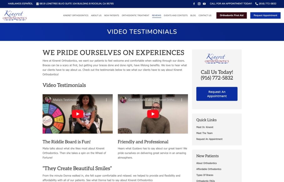
What it gets right: Kineret turns positive reviews into short patient-interview videos that work on the website and get repurposed across social channels.
You can put your orthodontic marketing ideas to good use both on and off your website by creating engaging video content. This is a cost-effective way to use limited resources often referred to as “repurposing.” Video content can feel intimidating to create, but it’s also a highly valuable tool for getting more views on social media.
Kineret Orthodontics cleverly turned positive reviews into videos by interviewing patients. These videos are a fun addition to their website, but they can also be used across social channels, including YouTube, Facebook, and Instagram.
Kineret Orthodontics is even diving into the world of TikTok. Short-form videos are great for repurposing on all your social channels, and they’re a great way to reach new patients and potentially go viral.
6. Rainieri Orthodontics: a homepage built to convert
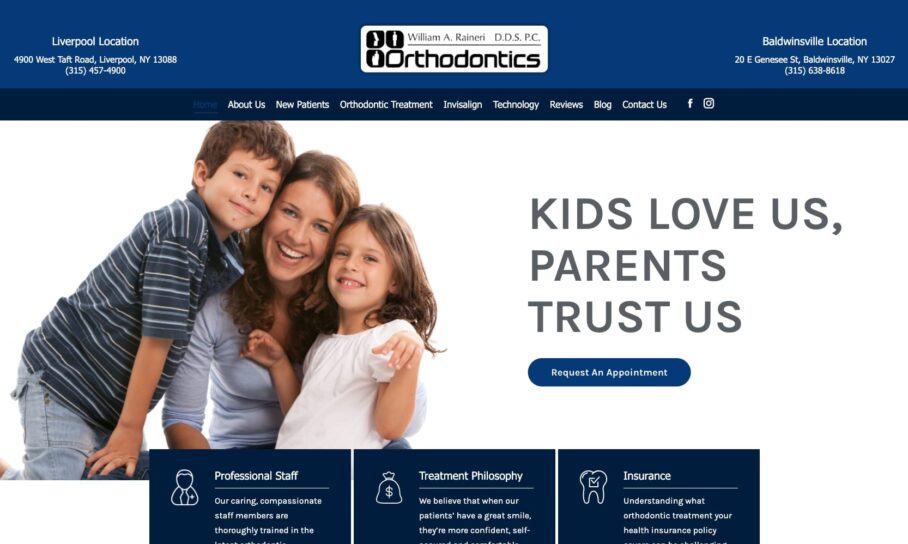
What it gets right: Rainieri keeps the homepage simple and front-loads the “VIP” conversion elements: a booking call-to-action, quick links, an intro, reviews, promotions, and maps.
The first line of attack when you’re ready to update your website is your homepage. Your homepage is one of the most crucial spaces for converting visitors into new patients. If it’s outdated, slow, or messy, website visitors won’t stick around to see why they should choose you over the competition. Rainieri Orthodontics keeps things simple and straightforward. On their homepage, you’ll find the VIP elements you should prioritize on your own site:
- Call-to-action for making appointments
- Quick links to the most relevant pages
- Introduction to yourself/your practice
- Positive patient reviews
- Current promotions
- Social media links
- Google Maps link
With all this information highlighted clearly on your homepage, you create a great patient experience online as an extension of your practice. Both current and future patients can get the most important information as quickly as possible.
7. Union Hills Dental: clean, minimalist design with breathing room
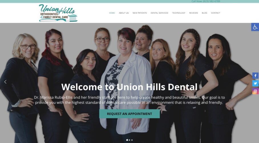
What it gets right: Union Hills uses minimalist fonts, a calm white-and-green palette, and generous white space that guides the eye down the page.
Union Hills Dental is a beautiful example of clean, clear website design. They chose minimalist fonts and a cool white-and-green design that evoke a general sense of calm. Even small changes like these can help your website have a big impact.
And don’t be afraid to incorporate white space into your website. It gives the reader a natural break and a desire to keep scrolling. The key is to let the important information stand out and direct visitors as they scroll.
But don’t make these website mistakes, this ebook breaks down the 12 most common SEO mistakes that could be hurting your website and what to do to correct them.

8. Oakdale Smile Spa: a spa-like experience carried into the design
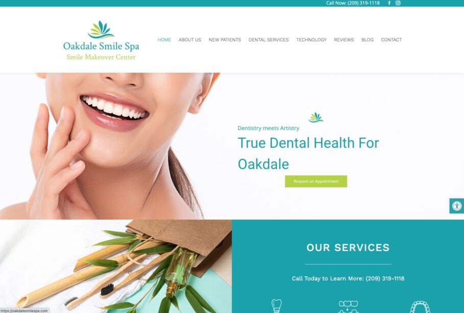
What it gets right: Oakdale delivers a calm, spa-like experience through clean design and beautiful imagery that matches the in-office feeling.
As the name suggests, Oakdale Smile Spa is an orthodontic practice that successfully delivers a spa-like experience, even from its website design. Their clean design elements and beautiful images match the type of experience you’d want to have at the orthodontist.
Overall, their website presents every piece of information patients need. From before-and-after photos, to services, to their regularly updated blog, Oakdale Smile Spa executes a peaceful, helpful website design flawlessly.
9. Rock Center Orthodontics: leading with a standout specialty
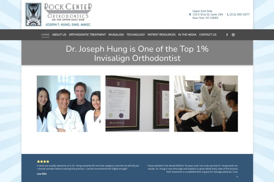
What it gets right: Rock Center features its top-1% Invisalign status front and center, building authority by playing to a clear strength.
If you’re struggling with your website redesign, sometimes the best option is to play to your strengths. Rock Center Orthodontics is in the top 1% of Invisalign providers and chose to feature this accolade on their website. You can see by their numerous awards and dentist bio that they’re the go-to choice for Invisalign in Manhattan. They also support this claim by sharing guest posts and mentions in other publications.
Featuring Invisalign doesn’t mean other services are less important to Rock Center. It simply builds authority for the practice as a whole.
If your practice has a specialty, focus, or notable recognition, feel free to bring attention to it in your website design.
10. Beach Orthodontics: personality and team photos that feel human
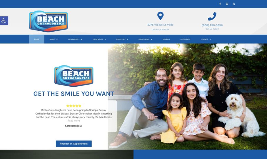
What it gets right: Beach Orthodontics ditches the clinical feel with coastal branding and fun, friendly staff photos right on the homepage.
Not all orthodontic websites have to feel clinical. In fact, they can be a great place to start infusing a little fun into your practice. Whether you have a practice mascot, theme, or random personal interest like model trains, bring that spirit into your orthodontic website. Beach Orthodontics serves up coastal fun in their design elements, which complements their beachside location.
Even better, Beach Orthodontics has fun, friendly photos of their entire staff right on the homepage.
Snap some silly photos of your team next time everyone is around and use them to update your orthodontic website.
11. Abari Orthodontics: a bio page with real personality
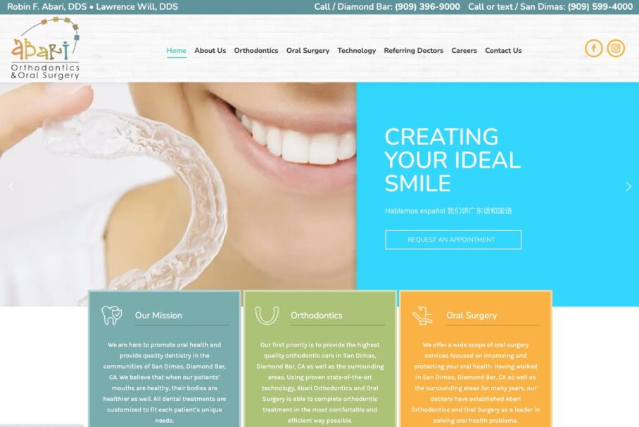
What it gets right: Abari’s team bios use casual, fun photos and personal details so patients feel like they’ve met the orthodontist before they walk in.
A quick, easy update you can make is to refresh your bio. Too often the bio page is a dry list of qualifications that reads more like a resume than a proper introduction. Use this space to highlight skills and to list personal interests, hobbies, and accomplishments.
Abari Orthodontics has a great bio page with fun, casual photos for their team members. It’s the perfect opportunity to showcase a little personality and connect with patients. If you want to know how to write a great orthodontic bio, be sure to include these elements:
- Introduce yourself and your practice upfront
- Include professional qualifications
- Share your passion and values, in life and in your practice
- Add personal interests so patients get a feel for your personality
A well-written bio can make meeting a new orthodontist a more comfortable experience and give patients a chance to connect with you. Updating your bio is a fast, simple change that can make a world of difference.
Elevating Your Orthodontic Website
A great website should be at the forefront of your marketing for orthodontists, and you can make a big impact with small changes. The three things to keep front of mind are user experience, website function, and overall design aesthetic.
If you have a clear plan to improve these areas, you’ll be on your way to creating a beautiful orthodontic website that converts visitors into patients while supporting existing patients and their needs.
Ready to turn one of these ideas into your own beautifully designed orthodontic website? Whether you want a smartphone video tour, a homepage built to convert, or the technical orthodontic website design and SEO that gets you ranking #1 locally, My Social Practice can help. Schedule a free consultation or check how your website performs today with our free website grader, then pick the one change you’ll make this month.
Frequently Asked Questions
What makes a good orthodontic website?
A good orthodontic website loads fast on mobile, makes booking a consult effortless, and uses real photos and video instead of stock clinical imagery. It reflects the practice’s personality, surfaces reviews and Google Maps for trust, and keeps navigation simple so first-time visitors find what they need in seconds.
How much does an orthodontic website cost?
It varies widely. DIY updates, a smartphone video tour, refreshed bios, a cleaner color scheme, can cost almost nothing, while a professionally designed, SEO-optimized website typically runs from a few hundred to several thousand dollars. Prioritize high-impact fixes first, then phase in the rest over time.
Should I build my orthodontic website myself or hire an agency?
DIY works well for small, incremental improvements like photos, bios, and copy. An agency makes sense when you need technical SEO, fast mobile performance, custom design, and a site engineered to rank and convert. Many practices start with DIY tweaks, then bring in help once they’re ready to scale new-patient growth.
What should be on an orthodontic website homepage?
Prioritize a clear booking call-to-action, a short intro to your practice, quick links to key pages, patient reviews, current promotions, social links, and a Google Maps link. Front-load these so both new and existing patients get the most important information as quickly as possible.
Do I need to own my orthodontic website?
It depends. Some providers lease websites you don’t fully control, which can be a problem if you switch marketing partners. Before you spend on a new website, understand whether you’re buying or leasing and what happens to the design, content, and domain if you leave.
How do I know if my orthodontic website is performing well?
Check your technical health and local ranking. A free website grader reveals page speed, content, and SEO issues, while a Google Maps SEO report shows how you rank locally. Together they tell you what to fix first for more traffic and new patients.

Adrian Lefler is the CEO and Co-Founder of My Social Practice and a recognized dental marketing expert with nearly two decades of experience. He is a trusted voice in dental marketing, AI in dentistry, and emerging technology, and he hosts BYTE SIZED, a podcast focused on dental AI, innovation, and technology.